Computime Corporate Website
OVERVIEW
Computime was founded in Hong Kong in 1974 as a digital clock manufacture and became a listed company in 2006 (HKEX: .0320). The company is currently transforming from solely OEM/ODM manufacturing to more technological solutions, including cloud, SaaS, PaaS, robotics, and more. As a result, the old-school manufacturing style of website no longer represented what the company is now or their future.
CONTEXT
I joined Computime in September 2020 as a Management Trainee and my first assignment was to redesign the corporate website. This was an amazing challenge and opportunity for me. Not only was I brand new to this company, but I had no previous experience in the manufacturing industry either. On top of that, the company had no previous data or benchmarking to draw from from the existing website.
My boss, the CEO, had decades of experience in manufacturing but had never heard of UX before. With his broad direction, I was tasked to figure out the rest without any other resources or teammates. Equipped with my strong foundation of processes and methods from General Assembly, I quickly created a game plan.


EMPATHIZING
In order to redesign the entire website I first needed to know what I didn’t know. I did this in three steps:
1. I scraped all the content from the old website. I put that in Notion and went through the content trying to organize and tag things by category and page. This allowed me to think about what content we might be missing and foundation for a site map.
2. As I was new to this industry, I conducted a thorough competitive and comparative analysis on our competitors’ websites in order to benchmark what I needed on our website.
3. I set up meetings with each department head across the company to learn about their function and the industry. I asked them what current frustrations they had with our current site, to identify who they thought were the users, and what they hoped to see in the new website.
After gathering all this data and information, I created a new site map.

DEFINING
With my limited resources, I did my best to conduct user research around the office. I employed interviews, card sorting, and dot voting to better understand the key users of the website. The key challenges became evident as organization of information, conciseness, and lack of visuals.
Through this, I created user personas and user journeys for each persona.
PROTOTYPING
*My notebook with my wireframes are currently stuck in Hong Kong-- I plan on retriving them in late May.
Adobe XD First Draft Hi-Fi Mockup
USER TESTING
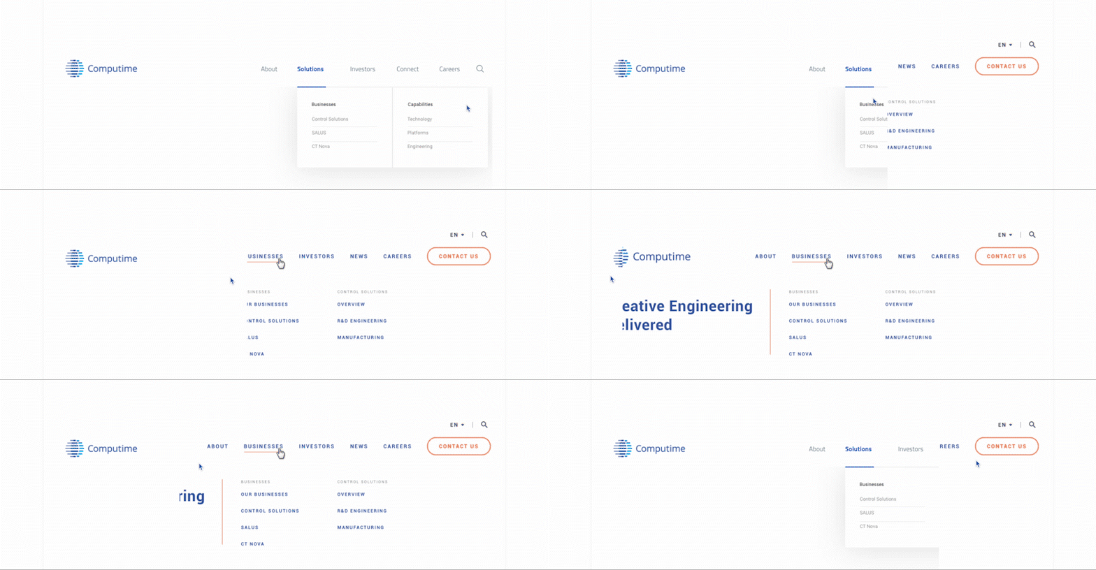
I conducted user testing throughout the office giving collegaues simple instructions like "Find the Investor FAQ", "Find how many factories we have". I was happy that most participants were able to find the goal within 3-clicks. The biggest insight through the user testing was determining the navigation headings and sub-headings. I conducted card sorting with 12 co-workers to find the most user-friendly organization.

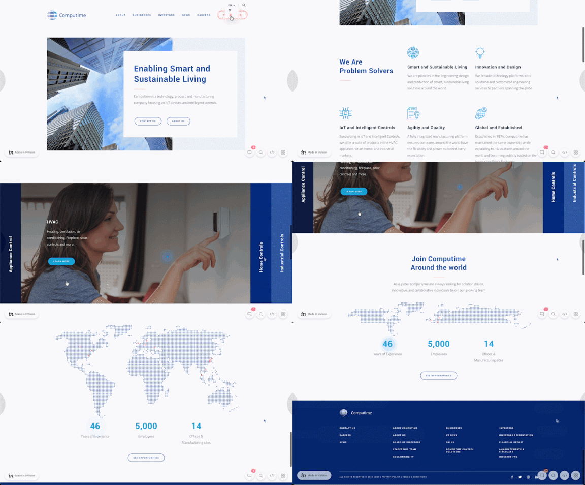
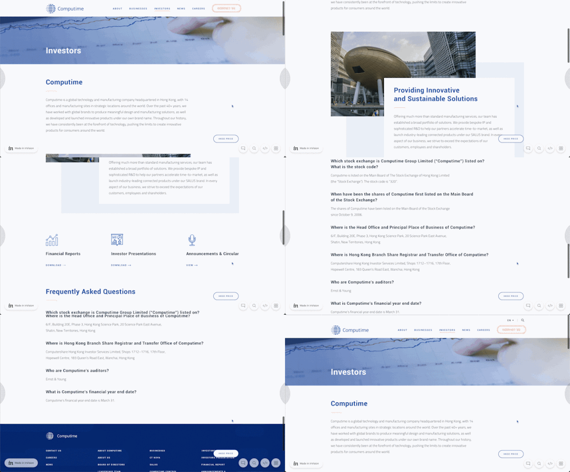
InVision Final Hi-Fi Mockup
**I have the free version of InVision and it is currently used for another live project, therefore I'm unable to put the interactive prototype live.
The biggest challenge was not being able to validate my designs to the extent I wanted to.
RETROSPECTIVE
This project was challenging given the lack of resources and support I was able to recieve, but at the same time it pushed me to quickly pick up any of that slack and learn on-the-fly. Being able to wear every hat under the UX/UI umbrella and working with a boss that wasn't familiar with Design Thinking or UX was an accelerated path to being able to take on almost any UX project now. If I could do this project again, I would pay for user testing with actual investors and customers.
I am most proud of my ability to think creatively and execute this entire project in less than three months.
After launch, the CEO was incredibly happy with the end product (as am I) and I believe we have one of the easiest to navigate & aesthetic websites in the industry. Going forward, if given the budget, I would like to integrate HotJar and conduct A/B tests to further improve the expereince.


